Flexible Timeline

An interactive and visually engaging module designed to highlight transformations and comparisons effortlessly. Perfect for products, services, or features, it delivers a clear before and after view with style and flexibility.
Install Now


Showcase your project's journey with style and clarity. Flexible Timeline lets you highlight milestones, phases, or events with customisable layouts that adapt to your needs.


1. How to Use

Installation: Navigate to Marketing > File & Templates > Design Tools > @marketplace > Shunyavkash folder to find the  Flexible TimeLine. Install it.


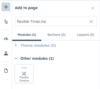
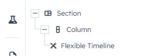
Integration: In the Marketing section, choose Website Menu > Website Pages and add the "Flexible TimeLine" module to the page you want.


2. Content Customization

The module offers 4 distinct timeline styles:
  1. Classic Vertical Timeline
  2. Compact Modern Cards
  3. Left-Aligned Timeline
  4. Right-Aligned Timeline


Each timeline entry consists of the following customizable elements:
Card Content:


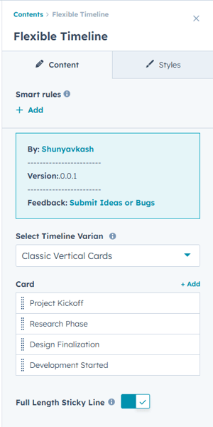
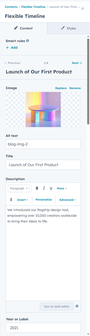
  • Title: Main heading for each timeline item

  • Description: Rich text content supporting formatted text, links.

  • Image: Optional image for each timeline entry .

  • Year/Label: Date, year, or custom label for timeline positioning.

Global Button (Optional):
  • Button Label: Custom text for the call-to-action button
  • Button Link: URL, email, phone number, or HubSpot CTA

  • Link Behavior: Option to open in new tab

  • Button Placement: Appears on all timeline cards when enabled.


Group 22


3. Style Customization

Container Settings
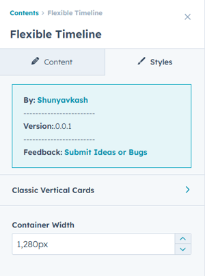
  • Default: Responsive width with auto margins

  • Options: Custom pixel values (e.g., 1200px)

Each timeline variant has its own comprehensive style settings:

Classic Vertical Cards:
  • Alternating left/right card layout
  • Central vertical line with connecting dots
  • Balanced spacing for desktop and mobile
 
Compact Modern Cards:
  • Streamlined card design with minimal spacing
  • Arrow-style connectors between cards and timeline
  • Optimized for content-heavy timelines
 
Left Aligned Timeline
  • All content aligned to the left side
  • Timeline line positioned on the left
  • Great for process flows and step-by-step guides

Right Aligned Timeline
  • All content aligned to the right side
  • Timeline line positioned on the right
  • Ideal for historical timelines and achievements

4. Card Styling Options


Background & Border
  • Background Color: color picker with transparency
  • Border Corner: Rounded corners (0-50px radius)
  • Border: Custom advanced border styling
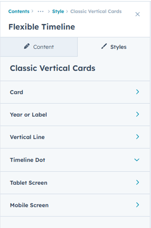
  • Shadow Options: Box shadow with X/Y offset, blur, and color

Content Spacing
  • Content Spacing: Internal padding for card content

  • Outer Spacing: Margin between cards and timeline line

  • Title Bottom Spacing: Space below card titles

  • Image Bottom Spacing: Space below images

Typography
  • Title CSS: Complete font styling for card titles
  • Description CSS: Font styling for card descriptions

  • Custom CSS: Advanced styling options

Year/Label Styling
  • Background Color: Label background with CSS gradients support

  • Inner Spacing: Padding inside label containers

  • Shadow Options: Custom shadow effects

  • Typography: Font styling for year/label text


We’re Not Here to Sell, We’re Here to Solve

Talk with strategic minds and developers, not just salespeople. Whether it’s your website, product, platform, or automation flow, let’s sketch the blueprint together. No fluff. Just meaningful collaboration. We reply same day.