Supported Browsers Overview

Version 12 and above |

Version 60 and above |
Version 79 and above |
Version 60 and above |

Version 1.34 and above |

Version 57 and above |
How to Use
Installation: Navigate to Marketing > File & Templates > Design Tools > @marketplace > Shunyavkash folder to find the Flexible Faqs Module. Install it.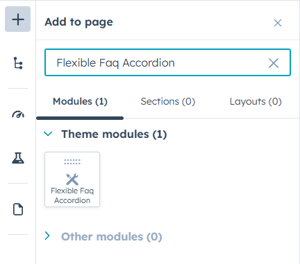
Integration: In the Marketing section, choose Website Menu > Website Pages and add the "Flexible Faqs Module" module to the page you want.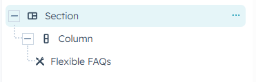
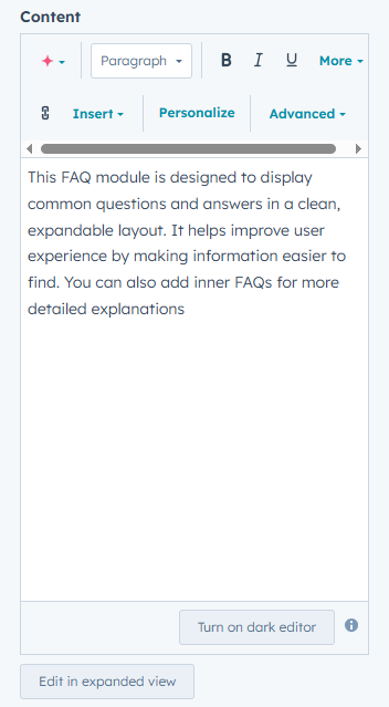
Content Customization
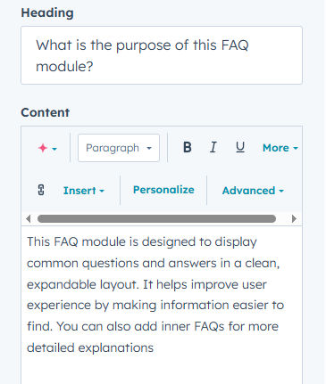
This module is designed to give you full flexibility to manage FAQ content with ease. You can add, edit, or remove questions and answers directly from the module editor.
FAQ Items & Inner FAQs
-
Each FAQ block allows you to add a Question (Heading) and a rich-text Answer.
-
You can include plain text, formatted text, links, bullet points, or even images inside the answer field.
-
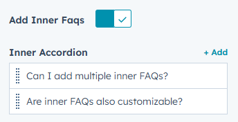
FAQs can be nested – meaning you can add inner FAQs under a main FAQ for structured, multi-level answers.
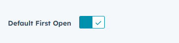
Default Open FAQ
-
You have the option to set the first FAQ to be open by default. This is useful when you want visitors to immediately see the first answer without clicking.
Rich Text & Media
-
Format answers with bold text, links, lists, and images.
-
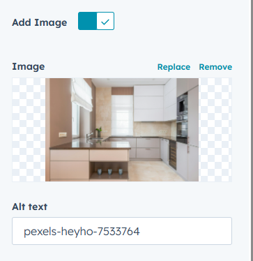
Add optional images alongside your FAQs for visual impact.
Add Images
-
You can add an image beside your FAQs (optional).
Icon Options
-
Choose between a default icon (arrow/plus, depending on your design preference) or upload a custom icon.
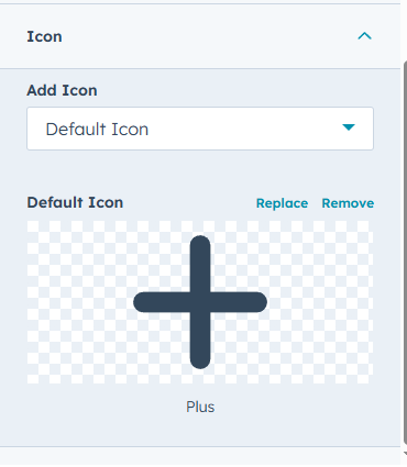
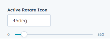
- Icons rotate automatically when an FAQ is expanded and you can adjust that rotate in Active
Style Customization
The module includes an extensive range of style settings so you can match the FAQ design with your website branding.
Layout & Spacing
-
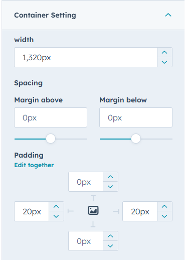
Adjust the container width to control how wide the FAQ section appears.
-
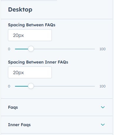
Customize spacing between:
-
Main FAQs
-
Inner FAQs
-
questions/answers with responsive options for desktop, tablet, and mobile.
-
Colors & Backgrounds
-
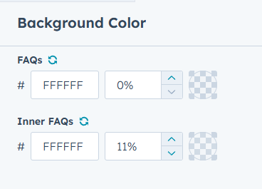
Set background colors for both FAQs & Inner FAQs.
-
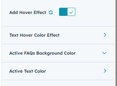
Define hover states for interactive effects
- Customize active FAQ colors to highlight the opened item.
Borders & Corners
-
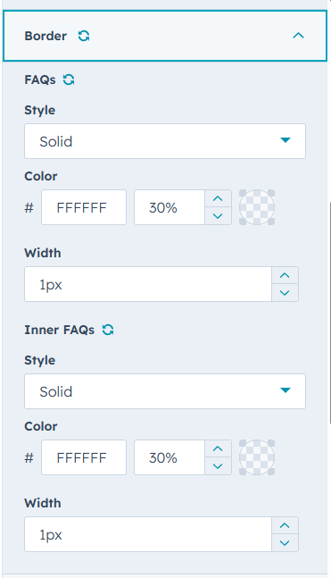
Add or remove borders for outer and inner FAQ blocks.
-
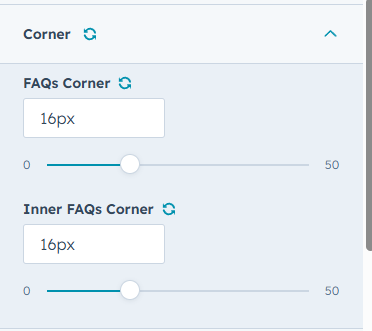
Customize border radius for rounded or sharp-corner designs.
Shadows
-
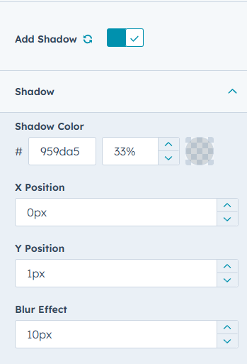
Apply box shadows to give depth and emphasis to FAQs.
-
Adjust shadow color, position, and blur for subtle or bold effects.
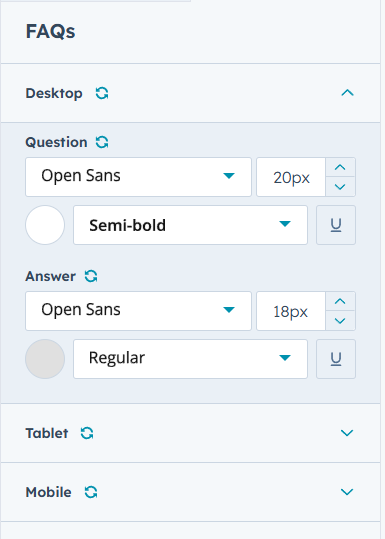
Typography
-
Full typography control for FAQs & Inner FAQs.
-
Adjust font family, size, weight, color..
-
Separate typography settings for desktop, tablet, and mobile.
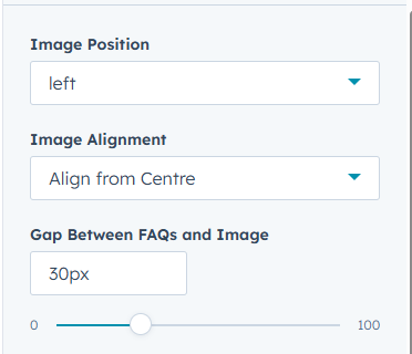
Images controller
-
Image position can be set to left or right.
-
alignment can be adjusted to top, middle.
We’re Not Here to Sell, We’re Here to Solve
Talk with strategic minds and developers, not just salespeople. Whether it’s your website, product, platform, or automation flow, let’s sketch the blueprint together. No fluff. Just meaningful collaboration. We reply same day.