Welcome to the Flexible Theme documentation. This guide will help you install and activate the theme in your HubSpot account so you can start building pages quickly and easily.
Install the Theme from HubSpot Marketplace
Follow these steps to add the Flexible Theme to your HubSpot account:
- Open the HubSpot Marketplace.
- Search for the Flexible Theme.
- Open the theme details page.
- Click the Get Theme or Install Theme button.
- Select the HubSpot account where you want to install the theme.
- Complete the installation process.
Installation: Navigate to Marketing > File & Templates > Design Tools > @marketplace > Shunyavkash folder to find the Flexible Theme . Install it.
Once the installation is completed, the theme will automatically be added to your HubSpot manager .
Access the Theme in HubSpot
After installing the theme:
You can also find the theme files inside:
- Go to Content > Website Pages.
- Click Create a website page.
- Choose Brand
- In the theme select Flexible.
- Choose a template and start editing your page.
Theme Settings
What’s Included in the Theme
The Flexible Theme includes:
- Pre-built page templates
- Drag-and-drop sections
- Custom modules
- Responsive layouts
- Global header and footer
- Theme settings for colors, fonts, spacing, and more
Customize the Theme
You can customize the theme directly from the page editor without editing code.
Theme customization options may include:
- Colors
- Typography
- Button styles
- Layout spacing
- Section styles
- Global content
To edit theme settings:
- Open any page using the theme.
- Click the Theme tab in the editor sidebar.
- Update the settings based on your branding needs.
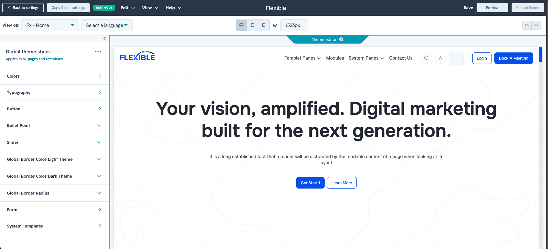
Theme Editor
The Flexible Theme comes with global theme settings that allow you to customize your website design without editing any code.
Open the Theme Editor
To access the Theme Editor:
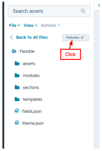
- Go to Content > Design Manager.
- Open the Flexible Theme folder.
- Click the Preview button from the top-right corner.
- The Theme Editor panel will open.
From here, you can manage all global design settings for the theme.
Available Global Theme Settings
The Theme Editor includes multiple customization options such as:
- Global Colors
- Typography
- Button Styles
- Form Styling
- Slider Settings
- System Template Styles
- Light & Dark Border Colors

Any changes made in the Theme Editor will automatically apply across all pages using the Flexible Theme.
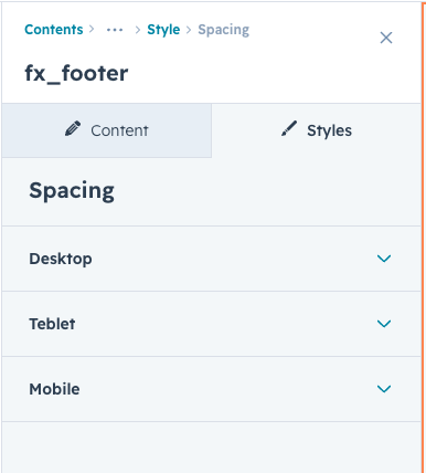
Customize Theme Styles
Inside the Theme Editor, you can easily:
- Change brand colors
- Update heading and body fonts
- Customize button styles
- Adjust spacing and border radius
- Modify form appearance
- Control global design consistency
This helps you create a fully branded website experience directly inside HubSpot.
Save Your Changes
After updating the settings:
- Click the Publish or Save button.
- Your changes will be applied across the selected pages and templates.
The Flexible Theme is built to make customization simple, fast, and code-free.
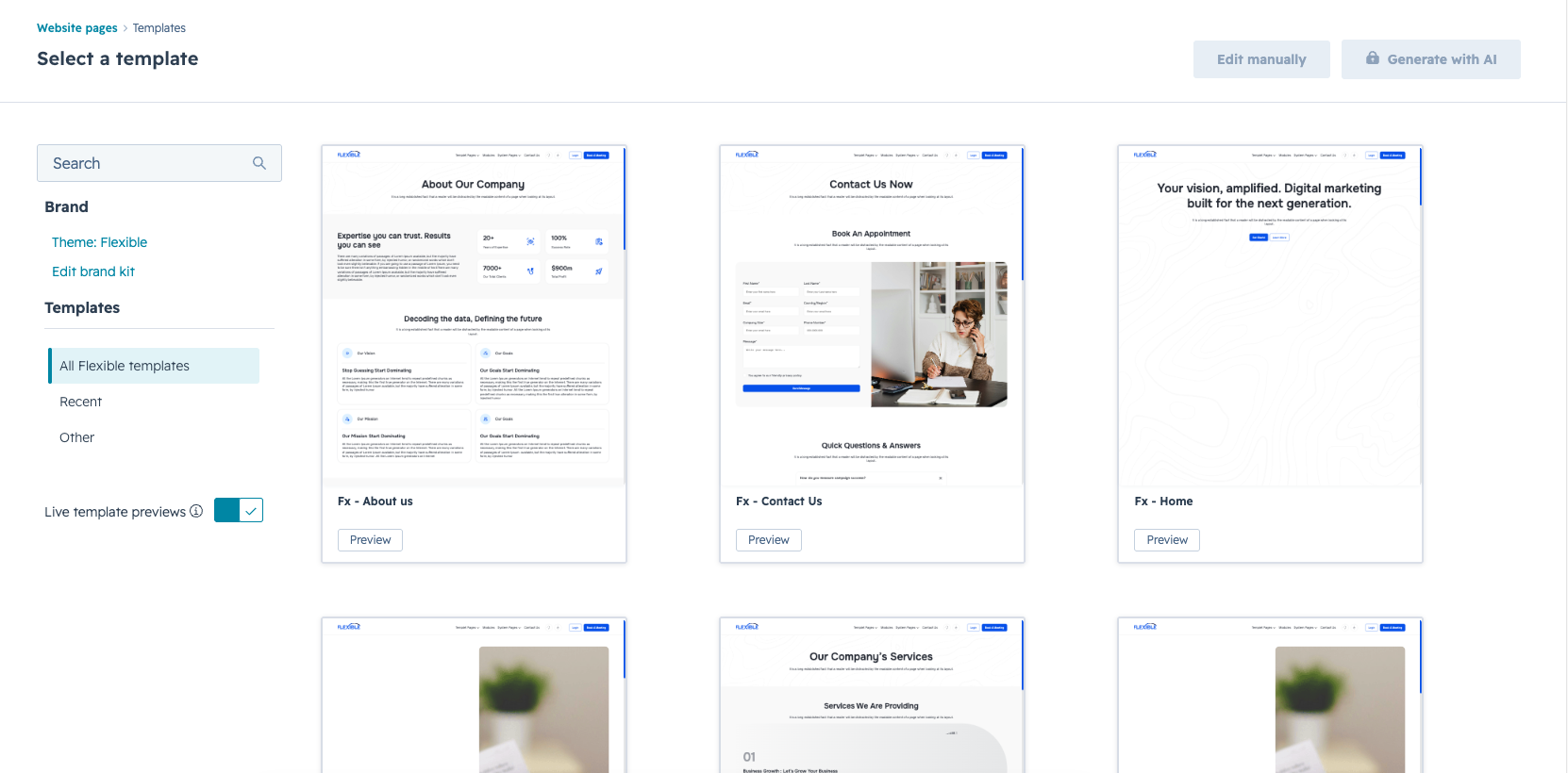
Feature Guides
The Flexible Theme includes a collection of powerful features and customization options to help you build professional HubSpot websites with ease. This section explains the main features available in the theme and how to use them effectively.
Drag-and-Drop Page Builder
Build pages easily using HubSpot’s drag-and-drop editor.
You can:
- Add, remove, and rearrange sections
- Customize layouts visually
- Create pages without coding
- Use reusable modules across multiple pages
Pre-Built Templates
The theme includes professionally designed templates to help you launch pages faster.
Available templates may include:
- Home Page - 1
- Home Page - 2
- About Page
- Contact Page
- Landing Page - 1
- Landing Page - 2
- Blog Templates
- System Pages
Each template is fully responsive and customizable.

System Page Support
The theme also includes styled system templates for a consistent website experience.
Supported pages may include:
- 404 Error Page
- 500 Error page
- Password Page
- Search Results Page
- Subscription Preferences
- Backup Unsubscribe Page
Responsive Design
The Flexible Theme is fully responsive and optimized for all devices.
The layout automatically adapts for:
- Desktop
- Tablet
- Mobile Devices
This ensures a smooth user experience on every screen size.
Easy Customization
You can customize the theme without editing code.
Using HubSpot editor controls, you can:
- Update text and images
- Change layouts
- Modify colors and fonts
- Adjust spacing and alignment
- Control section visibility
Page Settings
The Fx Page Settings module allows you to control the visibility of the global header and footer for individual pages directly from the HubSpot page editor. This is useful when creating landing pages, coming soon pages, sales pages, or distraction-free layouts where the default theme header or footer should not appear.
-1.png?width=469&height=542&name=image%20(1)-1.png)
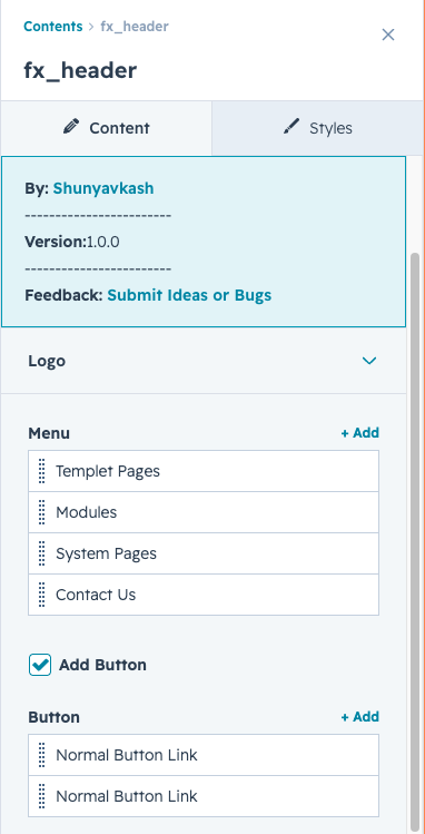
Header
The header is the navigation bar that sits at the very top of every page on your website. It helps visitors find what they need — with links to different sections, a search bar, language options, and a button to contact you or get started
Parts of the header
-
Logo
Your company logo shown on the left side. You can set a different version for light mode and dark mode so it always looks sharp.
-
Navigation links
The main menu links in the center of the header. You can add as many links as you need, and each one can open a dropdown with more options underneath.
-
Mega menu
A large dropdown panel for links that have a lot of sub-pages — like a "Products" or "Solutions" section. It can show icons, descriptions, or even your latest blog posts automatically
-
sub menu
The Header Sub Menu helps organize additional navigation links under a parent menu item. It allows visitors to quickly access related pages, resources, or categories directly from the main navigation.
-
Search
A search icon in the header. When clicked, a search bar slides in and shows suggested results as you type — no need to press enter.
-
Light / dark mode toggle
A small button that switches the whole website between a bright white look and a dark look. The visitor's choice is remembered the next time they visit.
-
Language switcher
If your website has multiple language versions, a globe icon appears so visitors can switch to their preferred language. It only shows up when more than one language is available.
-
Call-to-action button
A button on the right side of the header — usually something like "Get started" or "Contact us". You can turn it on or off, and customise the label and where it links to.
-
menu
On smaller screens, all the navigation links collapse into a menu that opens when the visitor taps the three-line icon in the top corner. The menu takes up the full screen so links are easy to tap.
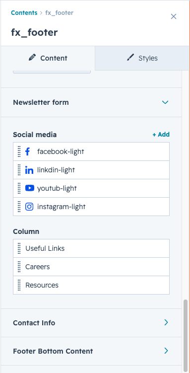

Footer
The footer is the section at the very bottom of every page on your website. It gives visitors quick access to important links, your contact details, social media profiles, and a newsletter sign-up. It also shows copyright and legal links.
Parts of the footer
-
Logo
Your company logo shown at the top of the footer. You can upload a separate version for light mode and dark mode so it always looks sharp on any background. -
Description text
A short paragraph below the logo — usually a one or two sentence summary of who you are or what you do. You can edit the text directly using the rich text editor. -
Social media icons
A row of small icon buttons linking to your social media profiles — such as LinkedIn, Instagram, or X. Each icon can have a separate light and dark version, and links to any URL you choose. -
Newsletter sign-up
An optional email subscription form below the social icons. It shows a heading you write, followed by an email input field with a submit button. The form is connected to a HubSpot form you select — responses go straight to your HubSpot contacts. -
Link columns
The middle section of the footer holds up to three columns of links. Each column has its own heading (like "Company", "Services", or "Resources") and a list of page links underneath. Links can go to pages, email addresses, or phone numbers. -
Contact information
A column on the right side for your contact details. It has a heading and a list of items — each one has a coloured icon and a line of text. Commonly used for your address, phone number, and email. Each item can also be a clickable link. -
Bottom bar
A thin strip at the very bottom, separated by a line. It has three parts: a copyright or tagline text on the left, a small list of links in the centre (like Privacy Policy or Terms), and another list of links on the right side. On mobile, these stack into one column.


Blog — listing page & post page
Your blog is made up of two main pages that work together. The listing page shows all your blog posts in a grid so visitors can browse and filter. The post page shows the full content of a single article when someone clicks to read it.
-
Blog listing page
This is the page where all your blog posts appear as cards in a grid. Visitors can browse by topic using filter buttons at the top.
- Section heading Title and short description shown above the grid.
- Topic filter buttons Clickable buttons to filter posts by topic. Active topic is highlighted.
- Featured image Thumbnail at the top of each card, links to the full post.
- Topic tags Coloured labels showing which topics the post belongs to.
- Author & date Writer's name and publish date shown on each card.
- Title & summary Post title and a short auto-trimmed preview of the content.
- Read more link A link at the bottom of each card with a label you can customise.
Blog post page
This is the page a visitor sees when they click on a blog post to read the full article.
Parts of the post page
- Post title and summary
The full title of the post as the main heading, followed by a short description pulled from the post's meta description field.
-
Topic tags
Coloured tag buttons below the description. Each one links back to the listing page filtered by that topic.
-
Featured image
A large banner image from the post's featured image. Corner roundness and spacing below it are adjustable.
-
Author, date and sharing icons
The author's name and publish date sit on the left — both label texts are customisable. On the right, Facebook, Instagram, and LinkedIn icons let visitors share the post directly.
-
Post content
The full body of the article, written in HubSpot's blog editor. Can include text, headings, images, videos, and any other content blocks.
-
Author bio card
At the bottom of the post — shows the author's photo, name, and biography. Clicking it goes to the author's page.
Page navigation (pagination)
When there are too many posts to fit on one page, pagination appears at the bottom so visitors can move between pages.
Modules are the building blocks of every page on your website. Each module is a ready-made section or piece of content — like a hero banner, a testimonials slider, or a contact form — that you can add, arrange, and customize without touching any code.
FX Hero Banner 1
e Hero Banner module is a modern and fully responsive section designed to showcase a strong page introduction with heading, description, CTA buttons, and animated image layouts. It supports multiple images with smooth reveal animations for an engaging first-screen experience.
Features
- Fully responsive hero banner layout
- Support for multiple hero images
- Animated image reveal effect using GSAP
- Custom background image support
- Flexible content alignment options
- Multiple CTA buttons support
- Support for link and CTA button types
- Adjustable spacing for desktop, tablet, and mobile
- Custom image border radius option
- Option to hide/show image gallery
- Full viewport height hero section support
Animation Support
This module uses the GSAP animation library to create smooth image reveal transitions when the page loads.
Usage Notes
- Recommended image count: 3 to 6 images
- Use high-quality images for best visual appearance
- Best suited for landing pages, agency websites, SaaS pages, and portfolio hero sections
- Background images and content spacing can be fully customized from module settings
FX Hero Banner 2
The FX Hero Banner Slider Module helps you create a modern fullscreen hero section with synchronized content and image sliders. It is designed for landing pages, homepage banners, and promotional sections with engaging visual presentation.
Features
- Fullscreen responsive hero banner layout
- Synchronized content and image sliders
- Multiple slide support
- Rich text content support
- Multiple button support per slide
- Link and HubSpot CTA support
- Autoplay image slider
- Custom pagination styling
- Optional reverse column layout
- Responsive design for all devices
Notes
- Hero section height automatically adjusts to the viewport height.
- Image and content sliders are synchronized automatically.
- Supports multiple buttons inside each slide.
- Autoplay functionality is enabled for the image slider.
- Large high-quality images are recommended for best visual results.
FX Logo Slider
The Logo Slider module is a responsive and continuously scrolling brand showcase section designed to display partner, client, sponsor, or company logos in a smooth carousel layout.
Features
- Infinite looping logo slider
- Smooth auto-scrolling animation
- Fully responsive carousel layout
- Support for light and dark logos
- Adjustable slider speed
- Pause on hover and focus options
- Center-focused carousel alignment
- Clean and minimal design
FX About Us
The About Us module is a responsive content section designed to showcase company information, achievements, statistics, and supporting visuals in a clean two-column layout. It combines text content, image grids, highlight boxes, and CTA options to create an engaging brand introduction section.
Features
- Fully responsive two-column layout
- Flexible image grid system
- Support for multiple content highlight boxes
- Light and dark mode icon support
- Reversible column layout option
- Customizable spacing and styling controls
- CTA button support
- Responsive image and content alignment
- Adaptive grid layout based on image count
Usage Notes
- Best suited for About pages, agency websites, startup sections, and company introductions
- Recommended image count: 2 to 4 images
- Use high-quality images for better visual presentation
- Highlight boxes work well for statistics, milestones, and achievements
- Dark and light icons improve theme compatibility and visual consistency
FX Services
The Services module is a flexible and responsive card-based section designed to showcase services, solutions, features, or offerings in a clean grid layout. It includes customizable service cards, icons, descriptions, CTA links, and responsive column controls.
Features
- Responsive service card grid layout
- Multiple column layout options
- Support for light and dark mode icons
- Flexible card alignment controls
- Optional top-aligned icon layout
- Service card CTA links
- Section-level CTA button support
- Fully customizable spacing and styling controls
- Responsive design for desktop, tablet, and mobile
Usage Notes
- Best suited for services, features, solutions, or product highlights
- Recommended for agency websites, SaaS pages, business websites, and landing pages
- Use concise headings and descriptions for better readability
- SVG icons are recommended for sharper visual quality
- Combine with CTA buttons for better conversion-focused sections
FX Recent Blog
The Recent Blog module is a responsive blog listing section designed to automatically display the latest blog posts from a selected HubSpot blog. It includes featured images, tags, author details, publish dates, excerpts, and CTA options in a modern card-based layout.
Features
- Automatically fetches recent blog posts
- Responsive blog card grid layout
- Featured image support
- Blog tag display
- Author and publish date support
- Blog excerpt preview
- Read more link option
- Section-level CTA button support
- Fully customizable spacing and layout controls
- Responsive design for desktop, tablet, and mobile
Usage Notes
- Best suited for blog pages, homepage blog sections, and content marketing websites
- Requires a connected HubSpot blog
- Recommended featured image size for consistent card layouts
- Use short excerpts for better readability
- Ideal for showcasing latest articles, news, and insights
FX Tabs
The Tabs Content module is a responsive interactive content section designed to organize information into multiple tab panels. It combines tab navigation, images, rich text content, icons, and CTA buttons to create an engaging and structured user experience.
Features
- Interactive tab switching functionality
- Responsive tab navigation layout
- Support for multiple tab items
- Light, dark, and active tab icons
- Image and content section support
- Optional CTA buttons inside each tab
- Flexible alignment and spacing controls
- Reversible column layout option
- Fully responsive design
Usage Notes
- Best suited for feature showcases, workflows, product details, and service explanations
- Recommended for SaaS websites, agency pages, and landing pages
- Use concise tab labels for better usability
- SVG icons are recommended for best visual quality
- Keep tab content structured for improved readability
FX Pricing Plan
The Pricing Plan module helps you create responsive and customizable pricing tables with monthly and yearly pricing options. It supports multiple pricing cards, feature lists, CTA buttons, and fully customizable spacing, alignment, and styling controls.
Features
- Monthly & Yearly pricing toggle
- Multiple pricing cards support
- Popular/Featured pricing badge
- Feature list with available/unavailable states
- Custom CTA button support
- Fully responsive layout
- Desktop, Tablet, and Mobile spacing controls
- Grid column customization
- Border radius and alignment options
- Light & Dark mode feature icons support
Notes
- At least one pricing card is required.
- Monthly and Yearly values should both be added for proper toggle functionality.
- Feature icons support both light and dark mode images.
- CTA buttons can open in a new tab if enabled.
FX FAQ
The FAQ module allows you to create responsive accordion-style FAQ sections with expandable answers, customizable spacing, CTA content, and fully flexible styling controls.
Features
- Accordion-style FAQ layout
- Expand/Collapse interaction
- Multiple FAQ items support
- Optional CTA content section
- Custom icons support
- Fully responsive controls
- Custom spacing and alignment options
- Smooth accordion animation
- Light & Dark mode icon support
Notes
- At least one FAQ item is required.
- The first FAQ item opens automatically on page load.
- FAQ answers support rich text content.
- CTA section is optional and can be disabled.
- Light and Dark mode icons can be added separately.
FX Testimonial Slider
Module
The Testimonial Slider module helps you showcase customer reviews and feedback in a responsive slider layout with ratings, profile details, and CTA support.
Features
- Responsive testimonial slider
- Customer rating display
- Multiple testimonial items support
- Profile image and role support
- CTA button support
- Smooth slider interaction
- Fully customizable spacing and styling
- Responsive layout controls
- Custom border radius options
Notes
- At least one testimonial item is required.
- Profile images are optional.
- Slider automatically adjusts based on screen size.
- Ratings support decimal and full values.
- CTA button section can be enabled or disabled.
FX Contact US
Module
The Book a Call Form module helps you create a responsive contact or meeting booking section with a HubSpot form and side image layout. The module includes customizable spacing, responsive controls, and styled form elements for a clean user experience.
Features
- HubSpot form integration
- Split layout with form and image
- Fully responsive design
- Custom form styling
- Custom checkbox styling
- Responsive spacing controls
- Section header customization
- Form success and redirect support
Notes
- A HubSpot form selection is required.
- The image section is optional.
- Forms automatically become responsive on smaller screens.
- Submit button automatically expands to full width.
- Checkbox and validation styles are included by default.
FX CTA
The CTA module helps you create responsive call-to-action sections with customizable headings, rich text content, and multiple button options. The module is fully responsive and includes flexible spacing, alignment, and styling controls.
Features
- Custom CTA section layout
- Multiple button support
- Rich text content support
- Responsive design controls
- Flexible content alignment
- Custom spacing options
- Border radius customization
- HubSpot CTA support
Notes
- Multiple buttons can be added inside the CTA section.
- Rich text content is optional.
- HubSpot CTA buttons are supported.
- Button layouts automatically adjust on smaller devices.
- CTA section styling can be fully customized from module settings
FX Inner Hero Banner
Module
The Inner Hero Banner module helps you create clean and responsive inner page banner sections with a background image, heading, and rich text content.
Features
- Inner page hero/banner section
- Background image support
- Heading and rich text content
- Content alignment controls
- Responsive banner layout
- Simple and lightweight structure
Notes
- Background image is optional.
- Rich text content is optional.
- Section ID can be added for anchor navigation.
- The banner automatically uses cover mode for background images.
- Suitable for inner pages, service pages, blog pages, and landing pages.
FX Expertise Stats
The Expertise Stats module helps you showcase business achievements, statistics, milestones, or company expertise using responsive content boxes with icons, numbers, and labels.
Features
- Responsive stats/expertise section
- Number counter style layout
- Icon support with light & dark mode
- Two-column content layout
- Flexible content positioning
- Custom spacing and styling controls
- Responsive grid layout
- Optional reverse column layout
Notes
- At least one expertise box is required.
- Icons are optional for each box.
- Prefix and suffix values can be used with numbers.
- Reverse layout option is available.
- Light and dark mode icons can be added separately.
FX Icon Cards
The Icon Cards module helps you display feature highlights, services, benefits, or informational content using responsive cards with icons, headings, and rich text content.
Features
- Responsive icon card layout
- Multiple cards support
- Light & Dark mode icon support
- Flexible content alignment
- Responsive spacing controls
- Card border radius customization
- Icon wrapper styling options
Notes
- At least one icon card is required.
- Icons are optional for each card.
- Light and dark mode icons can be added separately.
- Cards automatically stack on mobile devices.
- Rich text content supports formatted text and links.
FX Team Cards
The Team Cards module helps you showcase team members in a clean and responsive card layout. You can display member images, names, positions, and an optional button for additional actions or navigation.
Features
- Responsive team member card layout
- Add multiple team member cards
- Display member image, name, and Member post
- Customizable column layout for desktop, tablet, and mobile
- Adjustable spacing and column gaps
- Section heading and rich text support
- Optional button with Link or CTA support
- Custom card border radius support
- Flexible content alignment options
- Fully responsive image handling
Notes
- Recommended to use images with consistent dimensions for better card alignment.
- Member images automatically scale responsively.
- CTA buttons use native HubSpot CTA functionality.
FX Our Partners
The Our Partners module helps you display brand, client, or partner logos in a clean and responsive grid layout. It is ideal for showcasing trusted companies, sponsors, integrations, or business collaborations.
Module Features
- Responsive partner logo grid layout
- Add multiple partner or client logos
- Support for light and dark mode logos
- Adjustable columns for desktop, tablet, and mobile
- Customizable grid gap and spacing
- Section heading and rich text support
- Flexible alignment controls
- Border radius customization
- Fully responsive design
Notes
- Use transparent PNG or SVG logos for best results.
- Recommended to upload logos with similar dimensions for consistent alignment.
- Light and dark logos can be used for different theme modes or backgrounds.
FX Service Two Column Module
The Service Two Column module helps you showcase services, processes, or feature highlights in an engaging two-column layout with alternating content alignment and circular images.
This module is ideal for modern service sections, workflow explanations, or step-by-step content presentations.
Features
- Responsive two-column service layout
- Alternating left and right content alignment
- Circular image styling
- Automatic service numbering
- Rich text content support
- Responsive grid layout for tablet and mobile
- Custom spacing and alignment controls
- Light and dark theme support
- Flexible section header customization
Notes
- Service numbers are generated automatically based on item order.
- Circular images work best with square image dimensions.
- Reverse layout can be enabled individually for each item.
- Supports both light and dark theme styling automatically.
FX Two Column
The FX Two Column Module helps you create a clean and responsive two-column content section with text, image, and optional button support. It is ideal for showcasing services, company information, feature highlights, or promotional content.
Features
- Responsive two-column layout
- Content and image section support
- Optional reverse column layout
- Rich text content support
- Customizable button options
- Link and HubSpot CTA support
- Responsive image handling
- Flexible spacing and alignment controls
- Rounded image corner customization
Notes
- Reverse layout can be enabled to switch image and content positions.
- Rich text content supports lists and formatted text.
- Large images are automatically optimized for responsive display.
- CTA buttons use native HubSpot CTA functionality.
FX Info Map
The FX Info Map Module helps you display an interactive map alongside contact information in a clean and responsive layout. It is ideal for contact pages, office location sections, and business information areas.
Features
- Embedded map support
- Contact information cards
- Responsive split layout
- Optional reverse column layout
- Custom icon support for light and dark mode
- Flexible spacing and alignment controls
- Rounded corner customization
- Responsive contact card layout
- Link support for phone, email, and external URL
Notes
- Map iframe content should be responsive for best display results.
- Contact items automatically support email and phone link formatting.
- Separate light and dark icons can be used for theme compatibility.
- Reverse layout allows switching map and contact information positions.
FX Video Content
The FX Video Content Module helps you showcase video content with a custom poster image and interactive play button overlay. It supports YouTube, Vimeo, and custom iframe videos with responsive popup functionality.
Features
- Video popup functionality
- YouTube video support
- Vimeo video support
- Custom iframe video support
- Custom poster image support
- Animated play button effect
- Responsive video layout
- Fancybox popup integration
- Customizable play button shadow
- Rounded poster image styling
Notes
- Fancybox is used for popup video functionality.
- Supports YouTube, Vimeo, and custom iframe embeds.
- Animated play button effect can be enabled or disabled.
- Poster images are recommended for improved visual presentation.
- Large high-quality poster images provide the best user experience.
Performance & SEO
The module is built with performance-focused development practices to help pages load quickly and efficiently.
SEO-Friendly Structure
The module follows SEO best practices to help improve content visibility and search engine indexing.
SEO Features
- Semantic HTML structure
- Optimized heading hierarchy
- Accessible content layout
- Mobile-friendly design
- Fast page loading experience
- Search engine compatible markup