How to Use
Installation: Navigate to Marketing > File & Templates > Design Tools > @marketplace > Shunyavkash folder to find the Flexible Animation Links Module. Install it.
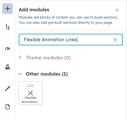
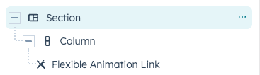
Integration: In the Marketing section, choose Website Menu > Website Pages and add the "Flexible Animation Links" module to the page you want.
Content Customization
Section Header
Add Heading
Toggle this option to display a heading at the top of your links section.
Heading Text
- Enter your desired heading text
- This appears as an H2 element above your links
- Ideal for section titles like "Our Services", "Explore More", or "Featured Projects"
Add Content
Enable this option to include descriptive text below your heading.
Content Area
- Rich text editor support
- Add context or introduction for your links section
- Maximum width can be controlled via style settings
- Supports standard formatting (bold, italic, lists, etc.)
Content Alignment
- Left: Header and content aligned to the left
- Center: Header and content centered with auto margins
Link Items
Each link item contains the following customizable fields:
Text
- The main label that appears for each link
- Automatically numbered (01, 02, 03, etc.)
- Appears in both the default state and hover animation.
Link Configuration
URL Settings
- Standard web links (https://)
- Email addresses (automatically prefixed with
mailto:) - Phone numbers (automatically prefixed with
tel:) - Call-to-action links
- Content pages
Link Options
- Open in new tab: Check to open links in a new browser window
- Rel attribute: Add relationship attributes (e.g., nofollow, noopener).
Hover Animation
Each link features an animated marquee effect on hover that repeats your link text with arrow symbols (⤙).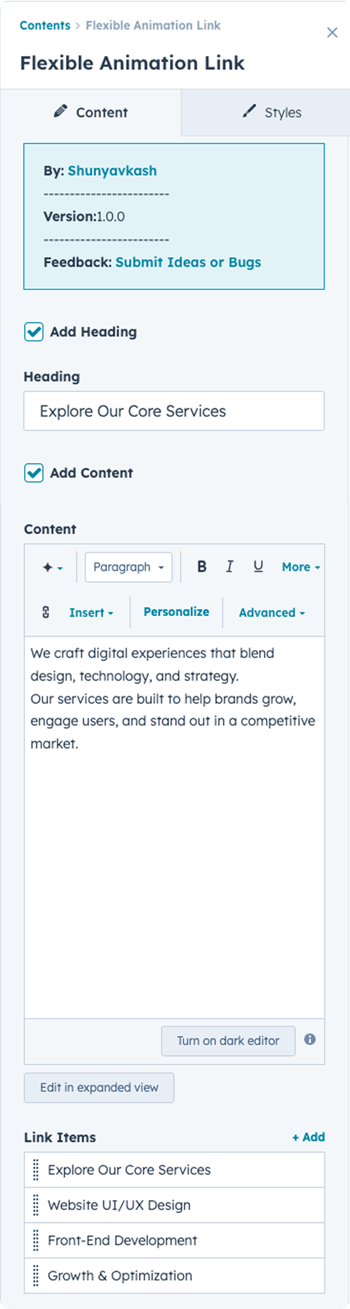
Style Customization
Typography
Heading Typography
Desktop Font Settings
- Font family, size, weight, style
- Text transform options
Responsive Sizing
- Tablet: Custom font size for medium screens
- Mobile: Custom font size for small screens
Link Typography
Controls the appearance of link text in both default and hover states.
Desktop Font Settings
- Font family, size, weight, color
- Applied to main link labels
Responsive Sizing
- Tablet: Adjust font size for tablets
- Mobile: Adjust font size for mobile devices
Note: Gap between number and text automatically reduces to 10px on mobile.
Link Number Typography
Customize the appearance of the sequential numbers (01, 02, 03).
Desktop Font Settings
- Independent styling from link text
- Control size, weight, and color
Responsive Sizing
- Tablet: Custom number font size
- Mobile: Custom number font size
Content Typography
Style the descriptive text below your heading.
Desktop Font Settings
- Applies to all content except headings (H1-H6)
- Font family, size, weight, color
- Line height and spacing
Responsive Sizing
- Tablet: Custom content font size
- Mobile: Custom content font size
Colors
Link Background Color
- Default background for each link item
Link Hover Background Color
- Background color that slides in on hover
- Creates the animated reveal effect
Link Hover Text Color
- Color of text in the animated hover state
- Applied to the marquee text
Link Border Color
- Border appears between link items
- Bottom border only (not applied to last item)
Spacing
Section Header Spacing
Control padding and margins around the header area.
Responsive Controls
- Desktop: Full spacing controls
- Tablet: Tablet-specific spacing
- Mobile: Mobile-specific spacing
Heading Spacing
Individual spacing controls for the heading element.
Responsive Controls
- Desktop: Margin and padding options
- Tablet: Tablet-specific spacing
- Mobile: Mobile-specific spacing
Link Spacing
Padding and spacing for each individual link item.
Responsive Controls
- Desktop: Link item spacing
- Tablet: Tablet-specific link spacing
- Mobile: Mobile-specific link spacing
Layout
Section Content Max Width
- Set maximum width for the content area (in pixels)
- Helps control text line length for readability
- Works with alignment settings for centering
Section Header Alignment
Options:
- Left: All header content aligned left, no auto margins
- Center: Header content centered with automatic margins
Cursor Customization
This module includes an advanced custom cursor interaction for enhanced UX.
You can control:
- Cursor Background Color
- Cursor Text Color
Technical Notes
- Module uses GSAP 3.12.5 for animations
- Includes Mouse Follower library (custom cursor support)
- Responsive breakpoints: Desktop (1024px+), Tablet (576px-1023px), Mobile (<576px)
- Marquee animation duration: 15 seconds
The cursor effect can be enabled or disabled from the module settings.
-png.png?width=350&height=1289&name=Frame%20175%20(1)-png.png)
We’re Not Here to Sell, We’re Here to Solve
Talk with strategic minds and developers, not just salespeople. Whether it’s your website, product, platform, or automation flow, let’s sketch the blueprint together. No fluff. Just meaningful collaboration. We reply same day.