Supported Browsers Overview

Version 12 and above |

Version 68 and above |
Version 65 and above |
Version 79 and above |

Version 1.34 and above |

Version 57 and above |
How to Use
Installation: Navigate to Marketing > File & Templates > Design Tools > @marketplace > Shunyavkash folder to find the Flexible Service Cards Module. Install it.
Integration: In the Marketing section, choose Website Menu > Website Pages and add the "Flexible Service Cards" module to the page you want.
Content Customization
-
Icon Selection: Decide whether to choose an icon from the HubSpot library or upload your own.
-
Choose Icon: Select an icon from the HubSpot icon library.
-
Upload Icon:Import your icon from your device.
-
Title:Enter the service title here.
-
Richtext:Describe the service in this section.
-
Link:Optionally, include a link to the flexible service card if desired.


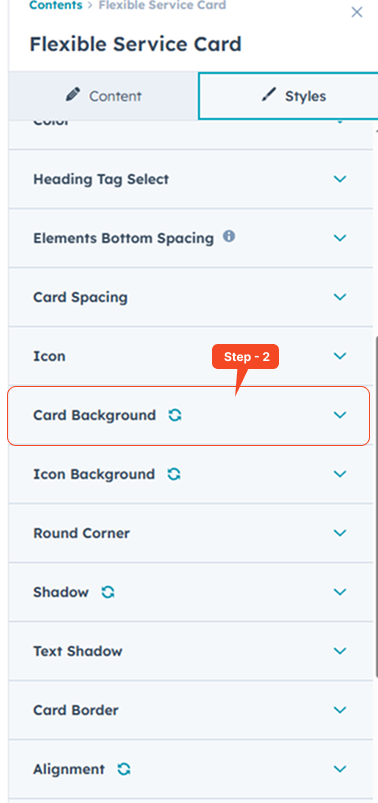
Style Customization
Utilize the Style Group options to refine the Flexible Service Cards:
Enhance Your Design: Customize Columns, Gap Spacing, Section Background, Flexible Service Card Colors, Elements Bottom Spacing, Flexible Service Card Spacing, Flexible Service Card Styling, Icon Appearance, Flexible Service Card Background, Icon Background, Round Corners, Shadow Effects, Border, Alignment, and Heading Style to perfect your unique aesthetic.

Add Image Overlay (Optional)
If your background image appears too bright or the text becomes hard to read, you can apply an overlay for better contrast.
-
Enable the Add Image Overlay checkbox.
-
Choose an overlay color that fits your design.
-
Adjust the opacity to control how strong the overlay appears.
-
To completely remove the overlay effect, set the opacity to 0%.
-


Animation Customization
Bring your Flexible Service Cards to life with smooth scroll animations. Customize how each card animates into view by adjusting:

Bring your Flexible Service Cards to life with smooth scroll animations. Customize how each card animates into view by adjusting:
-
Animation Type – Choose how the card appears (e.g., Fade Up, Slide In).
-
Data Easing – Control the animation's motion curve for smoother effects.
-
Duration – Set how long the animation lasts (in milliseconds).
-
Offset – Define how far the card should scroll into view before animating.
-
Delay – Add a delay before the animation starts.
-
Anchor Placement – Choose the trigger point for animation based on scroll position.
-
Anchor ID – Target a specific element as an animation anchor.
Use these settings to enhance user experience and make your services stand out with engaging, dynamic visuals. Add FeedBack
We’re Not Here to Sell, We’re Here to Solve
Talk with strategic minds and developers, not just salespeople. Whether it’s your website, product, platform, or automation flow, let’s sketch the blueprint together. No fluff. Just meaningful collaboration. We reply same day.